Equipment and Links
To view all of the individual lights I used to make this video click the links below:
Key Light: Aputure Light Storm COB 120D https://www.amazon.com/dp/B06X8ZTH8V?tag=parkerwalbe01-20
Aputure Soft Dome: https://www.amazon.com/dp/B01M9FW4VQ?tag=parkerwalbe01-20
Back/Hair Light: Aputure LS-mini20 3-Light Kit https://www.amazon.com/dp/B075CGHQ5G?tag=parkerwalbe01-20
All other equipment: https://kit.com/parkerwalbeck
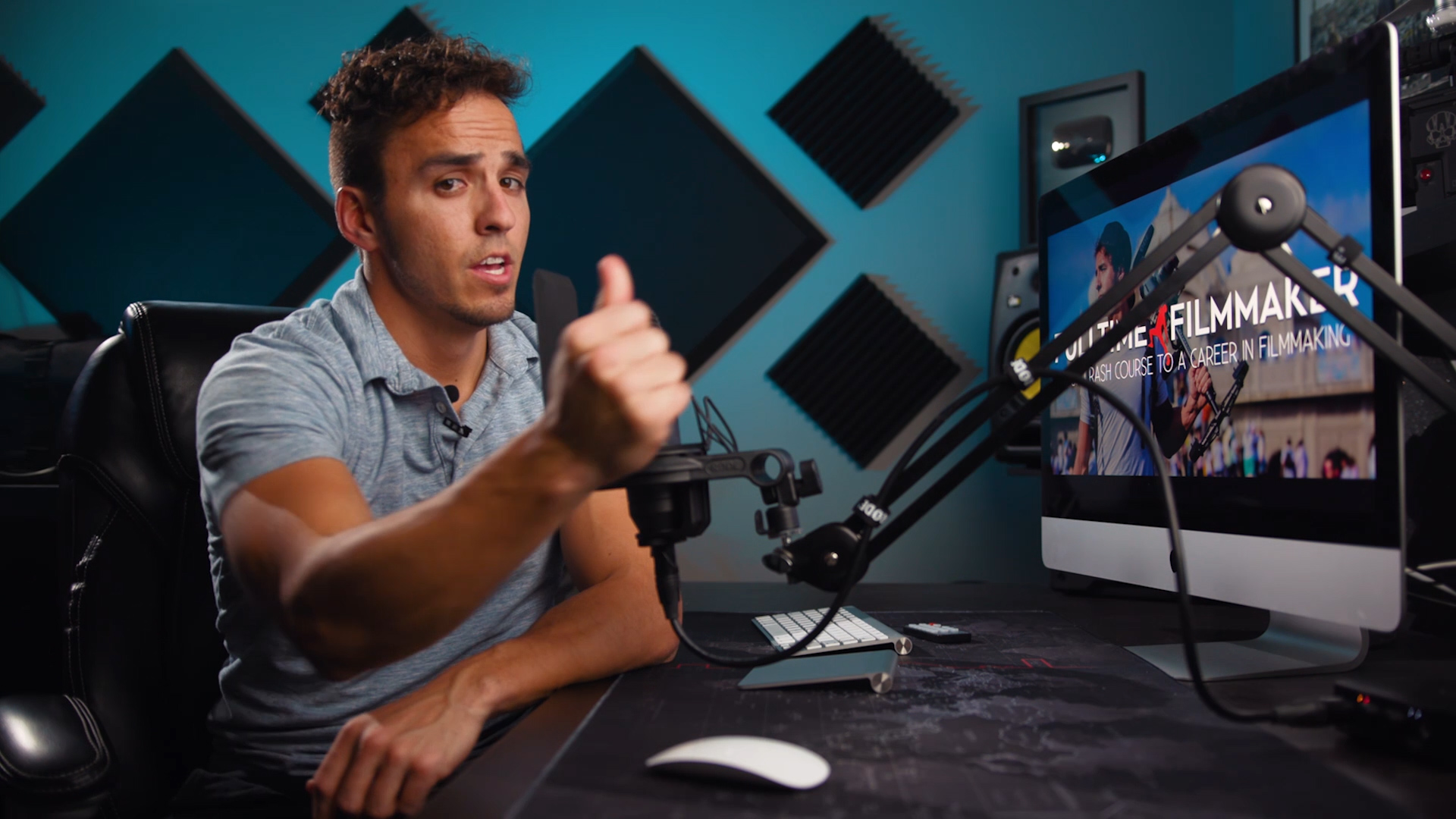
Parker Walbeck here with Full Time Filmmaker. Here you will find some of the biggest techniques that separate flat, dulled out images to professional, cinematic ones. These are the Cinematic Lighting Techniques that will allow you to accomplish just that.
I recently saw a post in the Facebook group of one of our members asking, “Why does my image look flat and washed out, but this image I pulled off of an ad I just watched looks super cinematic? What are they doing that I’m not, to get that cinematic look?”
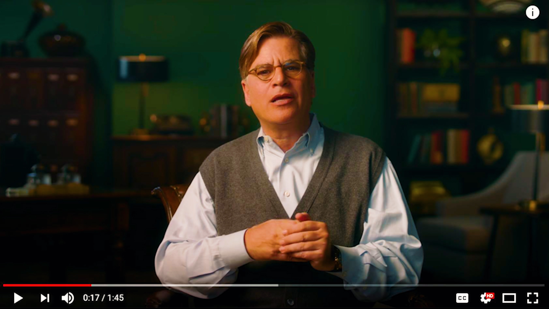
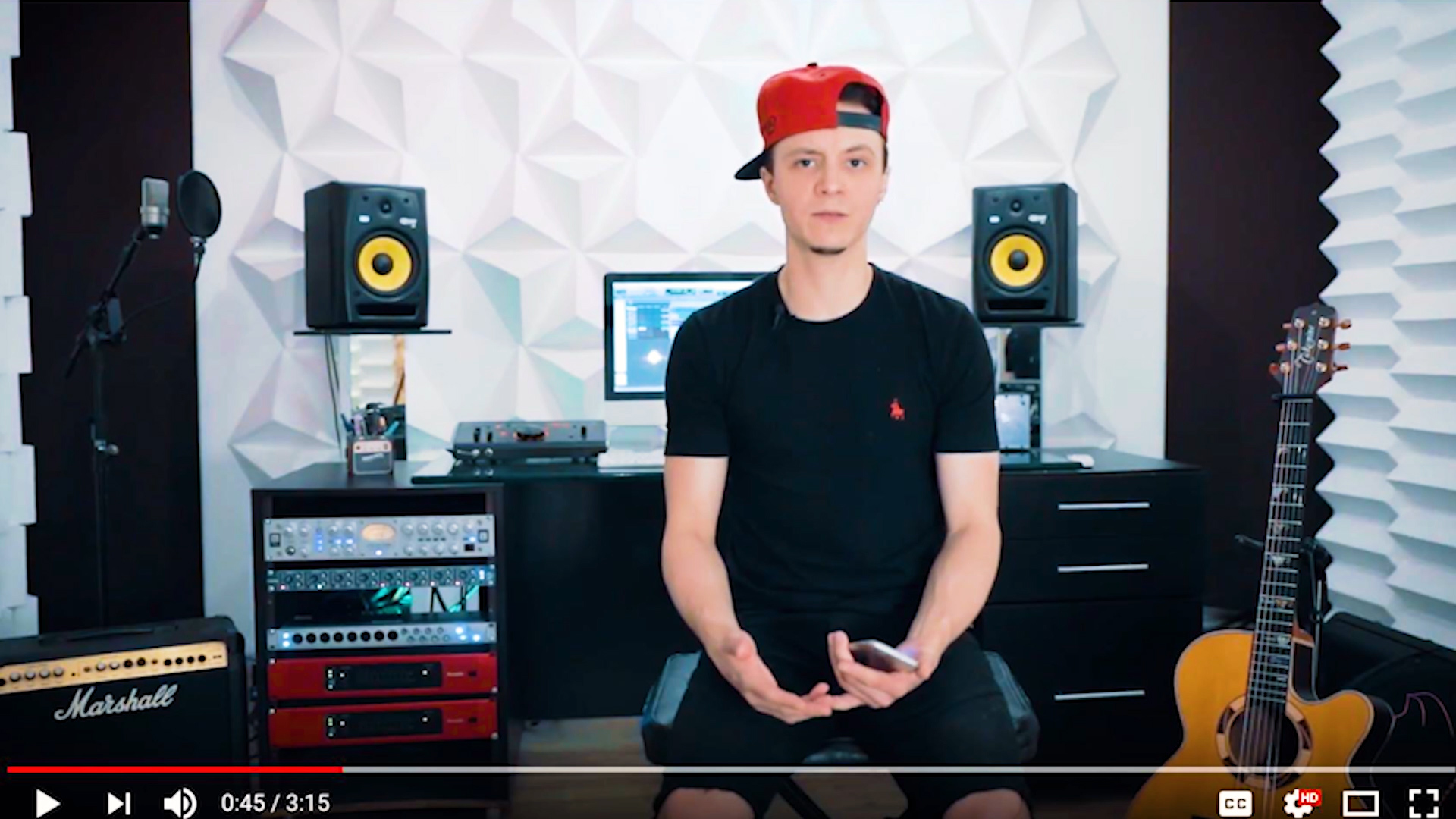
The answer: LIGHTING and DEPTH. Lighting is one of key elements to creating cinematic images and is one of the biggest factors that separates amateur looking videos from professional looking videos. And we’ll talk about how lighting can create depth to make your images look more 3 dimensional and cinematic.
Here are two quick main characteristics of LIGHT that I want to cover: Direction and Color.
It’s important to know these different elements because oftentimes people think “the lighting is bad” simply because there’s not enough light (light quantity), but there are many of situations where you have enough light, but the lighting still looks bad. And that’s usually because the light is too hard instead of soft (light quality), or the DIRECTION of light might be unflattering, or the COLOR of the light might be unflattering. So we’ll go over how these elements effect your image.
Direction of Light
First let’s talk about Direction of Light. Depending on WHERE you position your lights, the shadows will allow you to form different shapes or patterns on your subject. So using a basic 3 point lighting set up, we’re going to go over 5 common lighting patterns and when you’d want to use them. Now for those of you unfamiliar with 3 point lighting, 3 point lighting consists of setting up 3 lights around your subject as follows:
- A KEY LIGHT
- BACK/RIM/HAIR LIGHT
- FILL LIGHT
1.The Key Light
The KEY light is your main light that is used to light up your subject. And depending on where you place this key light will depend on the look, or light pattern that it gives you.
The most common placement of a key light is slightly above your subject and about 45 degrees from the camera off to one side. The reason for this is because it creates shadows on the face making your subject appear more 3 dimensional and thus creating depth to your image. And as we talk about a lot in this course, creating DEPTH is what helps images feel more cinematic and pop out from off the screen. Be careful though, not all shadows are good. If you put your light too high, you’ll start to create raccoon eyes on your subject.
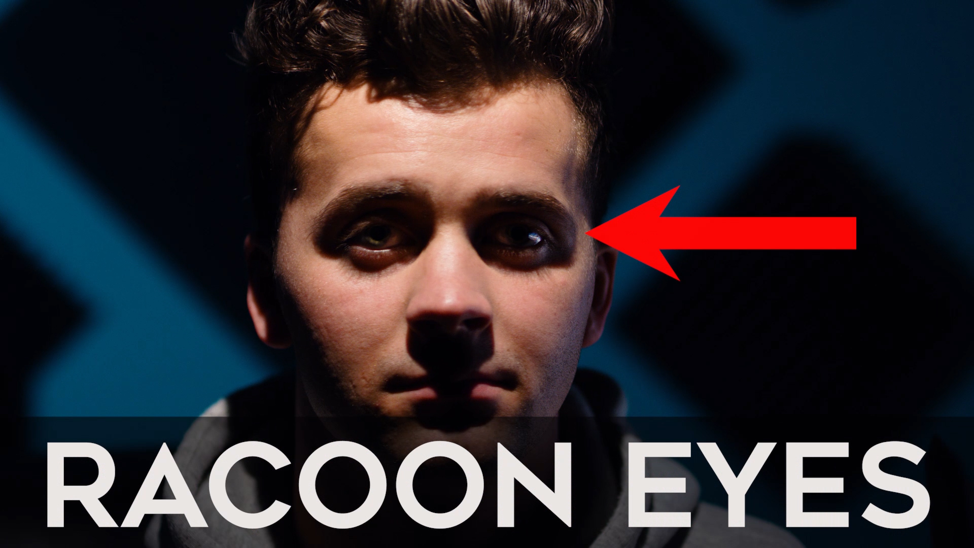
This generally isn’t a very flattering look. It kind of resembles shooting at noon day, which isn’t the prettiest light to shoot in. However, it could be useful if you want to create mystery and keep your subject from fully being revealed by not being able to see his eyes. But you also don’t want to put the light too low, first of all because light sources don’t naturally come from below us, so it’s not a very natural look, but also it gives you that flashlight around the campfire look that tends to be more of a spooky scary feel. Plus it highlights areas that aren’t super flattering like underneath the chin, the nostrils, the eyebrow ridge etc.
So, by having the light slightly above the subject, you create a nice drop shadow. A drop shadow is the shadow underneath the chin that outlines the jaw line, which is typically a more flattering look and also helps create dimension and depth. Especially if you’re trying to hide a double chin, you want to make sure that light is high enough to shade the under chin area. With this key light position you also have the subject’s eyes lit up nicely, which is usually the main part of the face that you want your audience to focus on; and if you look closely, you can actually see your light source’s reflection in your subject’s eye, and this is called a Catchlight.
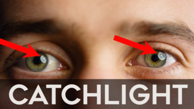
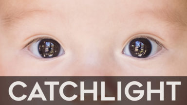
Having a strong catchlight can help draw your viewer’s attention to the eyes and it gives your subject that sparkle in the eye that is usually very flattering. And depending on the shape of your key light, you can get a variety of shapes of catchlights in the eye.
For example, if you use a square soft box or a window as your key light, you’ll get a square catchlight. If you use an octobox, you’ll get more of circular catchlight. If you’re outside shooting and using light reflected off of surrounding objects then you’ll see those reflected objects in the catchlight of your subject’s eye. So those are a just couple things I look for when lighting my subject to help give them a more cinematic look.
Now let’s move the position our key light to show you the 5 Different lighting patterns, and the effects they each have on your image:
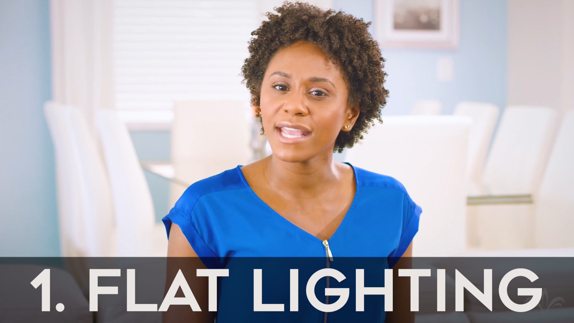
- Flat Lighting: As we move the light directly in front of our subject, we get an even, flat look to our image and this is called FLAT LIGHTING. Flat lighting on the face will mean that your subject is well lit, and you are unable to see any shadows along their face. This will give you the least dramatic look out of the 5 lighting patterns we’ll talk about and is often used for a more light hearted setting like commercials or beauty shots that allow you to see every detail of the skin. This look doesn’t give a lot of dimension or depth to your subject though, so it isn’t necessarily looked at as the most “cinematic” or dramatic option, but again, gives you more of a bright, happy, and light hearted feel.
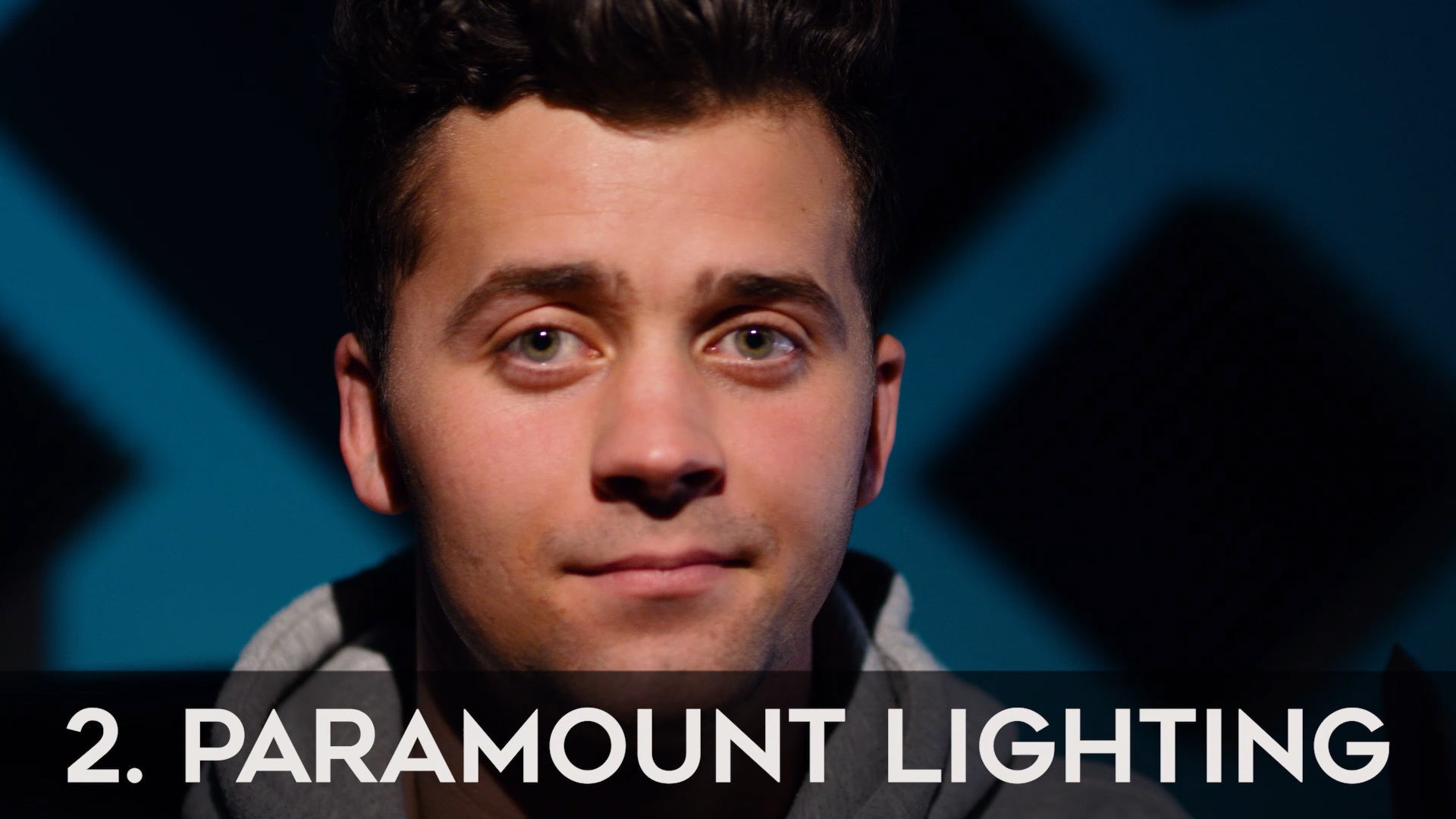
- Paramount or Butterfly Lighting: Now If we keep the light in the same spot but just raise it up slightly from the flat lighting position, we get what is called Paramount or Butterfly Lighting effect. Paramount refers to Paramount Pictures, who used this as their signature lighting style when it came to shooting their leading actors and actresses. The word butterfly refers to the little shadow under the nose that this lighting position creates, and is shaped kind of like a butterfly. This lighting pattern is typically a more feminine lighting pattern, because when used properly, the shadows will accentuate the cheekbones, creating depth to the face. But, Be careful with the height of your light on this look, because if you bring it too low, you will lose your drop shadow under the chin, along with the butterfly shadow under the nose, creating a flatter, 2 dimensional image, or if you raise it too high, the eyebrow ridge will cover the eyes giving you raccoon eyes again, and your butterfly light will start to crawl onto the lips, making for a weird, unwanted shadow on the mouth.
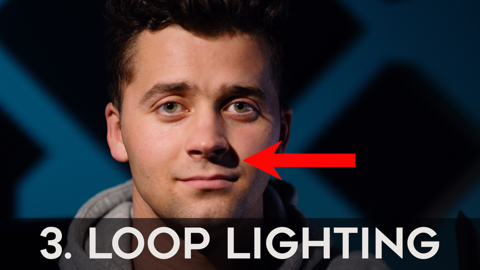
- Loop Lighting: Let’s now move the light slightly to the side, and you’ll start to see that butterfly shadow turn into a side nose shadow. This lighting pattern is referred to as LOOP lighting because the nose shadow creates the shape of a loop on the cheek. And this lighting pattern is generally used on rounder faces as the shadows it creates helps the face seem slimmer and longer.
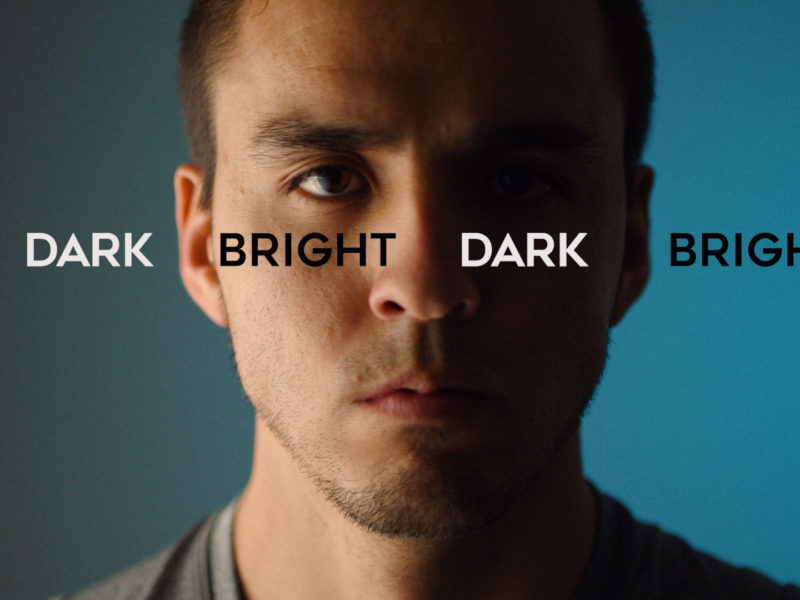
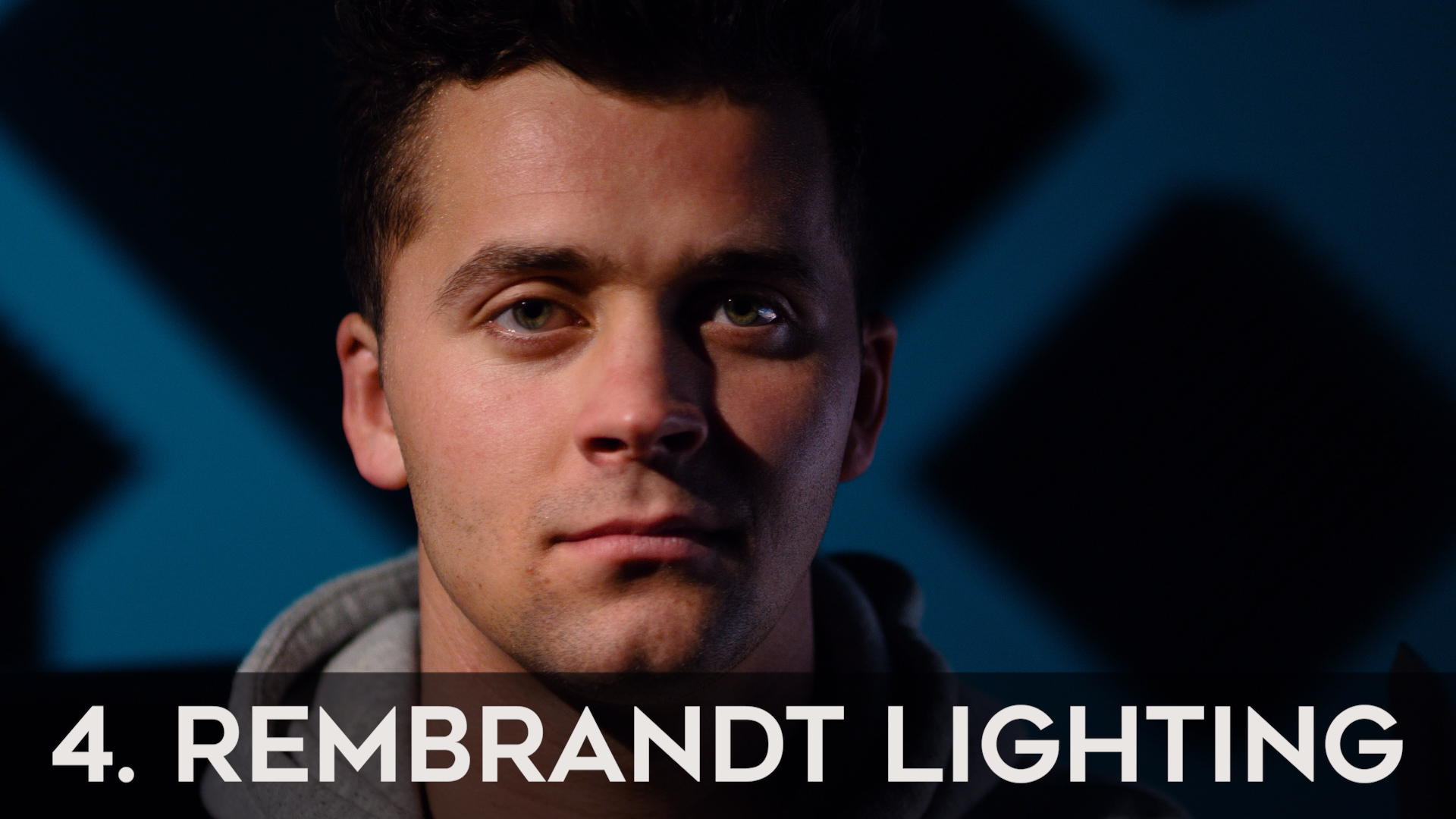
- Rembrandt Lighting: As we continue moving the light farther to the side, about 45 degrees from our camera, that nose shadow connects with the cheek’s shadow creating the lighting pattern Rembrandt Lighting. Rembrandt lighting gets it’s name from a Dutch painter named Rembrandt, who used this lighting pattern for many of his paintings and this lighting pattern is known for creating a triangle of light on the subject’s cheek and is probably the most popular lighting pattern used in Hollywood films as it creates a dramatic cinematic 3 dimensional depth to the subject’s face, and the lighting pattern that I like to use most. Now within Rembrandt lighting, depending on where you position your camera, you can get different looks as well. If you position your camera on the brighter side of your subject, this is called BROAD LIGHT. And If you position your camera on the darker side of your subject, this is called SHORT LIGHT or the DARK SIDE. It’s most common in cinema to shoot on the short, or “dark” side, as it creates more drama and depth. So generally speaking, I personally like to position my camera on the dark side of my subject for a more cinematic look. And according to Hollywood director Shane Hurlbut, the FIRST RULE in lighting “Over The Shoulder” scenes (when you have two subjects talking to each other), is that you should always place your camera on the dark side of your subjects.
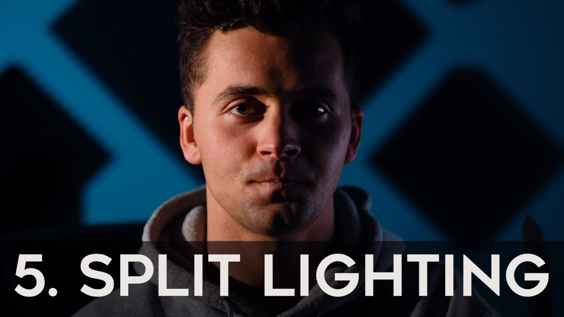
- Split Lighting: Now lets move our key light 90 degrees, or completely to the side of our subject, and we will see the entire side of the face become shadowed. This is called SPLIT LIGHTING, because it splits the face in half and this lighting pattern is used to create an even more dramatic look, and is also popular in Hollywood films, especially during scenes that are meant to be super dramatic. And where Paramount lighting is typically used to create a more feminine look, split lighting tends to make your subject look tougher and more masculine.
So, as you can see, just with the positioning of our ONE key light, we can create a wide range of looks and feels to our image. Let’s now look at our second light of our 3 point light set up and that is the backlight, rim light, or hair light.
2.The Back/Rim/Hair Light
Backlight meaning it lights up the back, or if it’s slightly higher, it becomes more of a hair light, or if it’s more to the side; a rim light. Backlight as we talk about in the natural lighting video is commonly used during golden hour, when the sun is low in the horizon and starting to set. So by using a backlight, we are replicating that golden hour look. Sources of backlight can often times be practical lights as well, like a window or lamp, or anything in the background that looks natural to help light up the back of your subject. The purpose of the backlight or rim light is to create a halo, or rim around the outline of your subject to help separate them from the background and create depth, shape, and form. You can play with the exact positioning of this light to create slightly different looks.
Our third and final light in our 3 point lighting set up is the FILL LIGHT.
3.The Fill Light
As the name states, the fill light fills in light usually on the opposite side of your key light making your shadows less dramatic. Depending on the mood of your story and/or scene, you can choose to use a little or a lot of this fill light. The more fill light you use, the less contrast your image will have and this is referred to as high key lighting, which is used more in comedies, romances, sitcoms, commercials, beauty shots etc. It gives a more light hearted, less dramatic look. Whereas, when you have less fill light, it creates more contrast, referred to as low key lighting, and is used in more dramatic scenarios and is generally looked at as “more cinematic” due to the added depth it gives your subject. 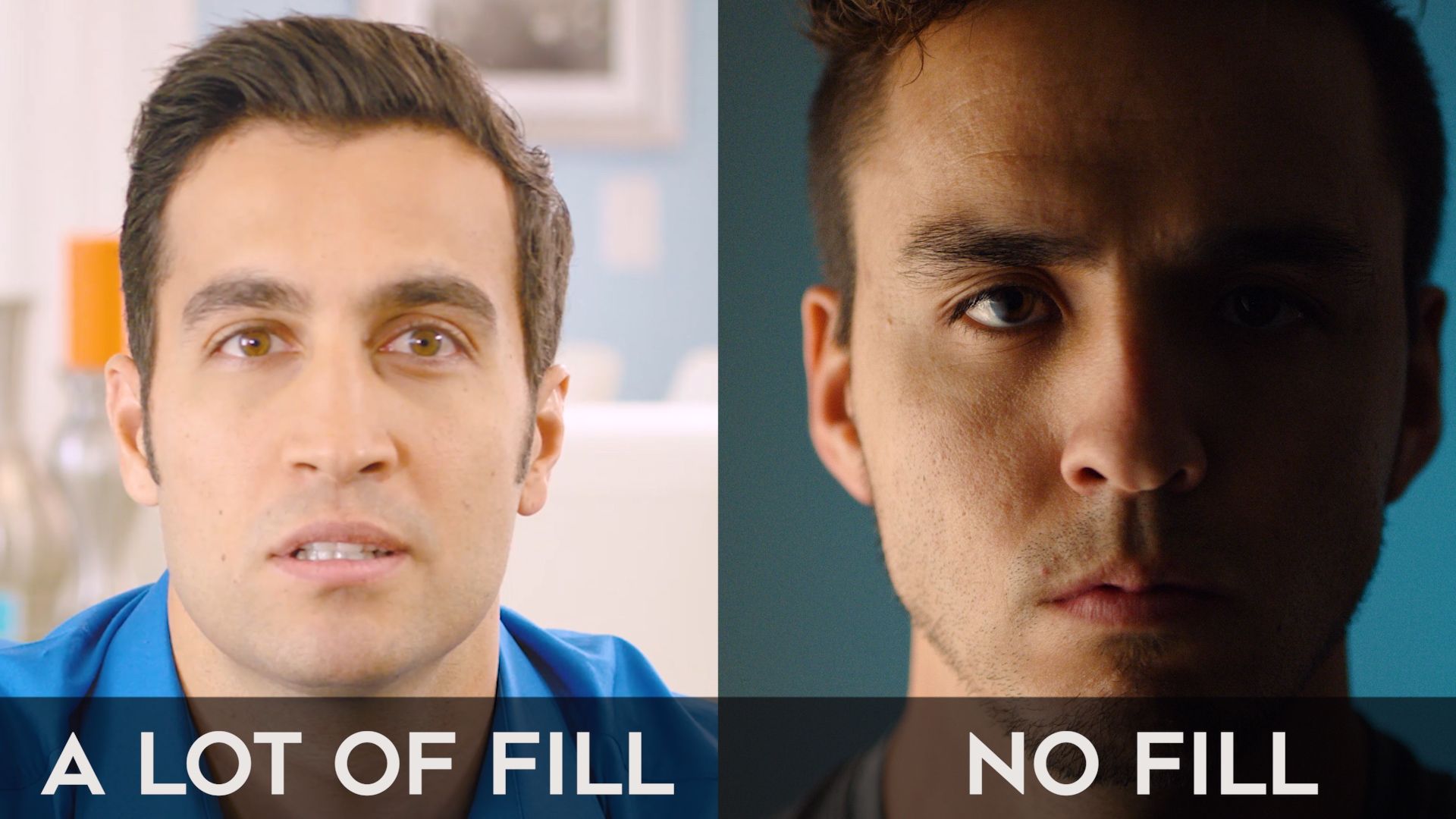
Now I rarely use a fill light for my set ups, but rather, I just have my soft key light and a backlight, and if I need any fill, then I’ll use the white side of my 5 in 1 reflector. But because I like the more cinematic, contrasty look, I actually rarely use any fill light at all, and I’m not alone in this, as I’ve heard Shane Hurlbut mention that he never fills light from the opposite side of the key light. So you can definitely get away with only using a 2 light set up and then just having a 5 in 1 reflector ready in case you want to fill. However, make sure you understand what each color on your 5 in 1 reflector does. I almost always use the white side because WHITE will reflect a SOFTER light back on your subject. If you flip it around to the black side, black actually absorbs light, so you use black when you want to take away light rather than fill light. So if you have some unwanted light spilling onto your subject or on your background then you would use the black side to “flag” or block the light from hitting the area you don’t want it to hit. And then if you flip it over to the silver side, you’ll get a harder light reflecting back on your subject.
So there you have it, those are the 3 main lights in a basic 3 point lighting set up, and some of the lighting patterns that can be created. Now one other thing to point out when lighting your subject is to make sure your subject isn’t positioned flat up against the wall. Going back to the example at the beginning, the key differences between these two images were the lighting and the depth.


The lighting helps create depth, but so does the position on your subject! In the left picture, the subject is farther removed from the camera and closer to the back wall, so it’s hard to separate him from the background. Whereas, the example on the right, the subject is much closer to the camera and there’s a lot more distance between him and the wall. Not only will this allow you to get some depth of field and blur our your background more, but it will also make your subject brighter than the background as your subject get’s closer to the your key light, and your background gets further away from the key light. Be careful though, unless you’re going for a pitch black background look, you’ll want to make sure you have some light on your background to give your audience some context as to where your subject is.
This can either be done by allowing your other lights to spill on the background, or you could add another artificial light lighting up just the background, or you can use practical lights like a window, a lamp, or a computer screen to help give the rest of your frame a little more life.
A common lighting pattern that can be created by using a background light is called checkerboard lighting, which basically means, you lights up the background on the dark side of the subject, but leaves the background dark behind the bright side of the subject, creating a checkerboard effect.
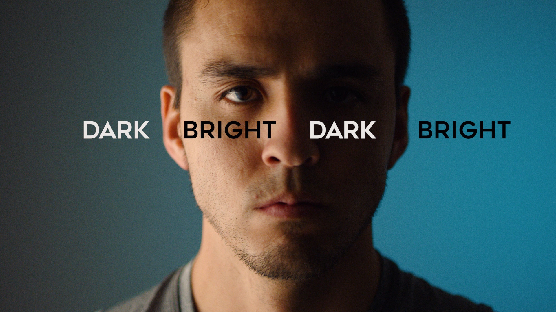
This method once again is used to create depth by contrasting the light and helping the subject pop from the background.
To take it one step further, you can add a gel to your background light to great some color contrast which brings me to our second characteristic of light, which is COLOR.
Color of Light
We discussed this in the white balance video (white balance video is found in the Full Time Film Maker Course) and how each light source has a different color temperature, so it’s important to know what color temperature your light is and make sure you set your camera accordingly to get the right color balance in your image, but a great way to create depth and add to the cinematic quality of your video is to add color contrast. We talk about this more in the color grading video in the editing section (found in the course) but color contrast basically means that your foreground and your background are different colors. So in this example here, I have my subject lit with a 3200 kelvin LED light, and in the background I have a window letting in Daylight at around 5600 kelvin.
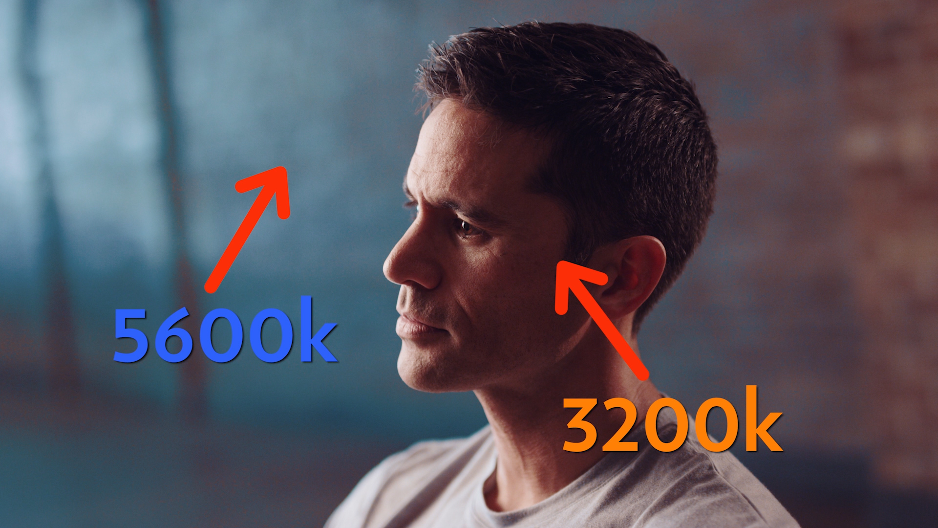
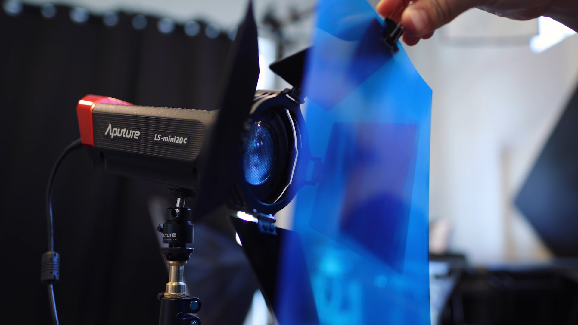
This creates color contrast which helps the subject stand out from the background. To create a similar look artificially, you can use gels to create different looks and color combinations. For example, with the background being lit with a much bluer light, it creates color contrast and helps a human face pop out from the background. And I use a blue light to light the background because my skin is an orange tone, which is a complimentary color to blue, giving it the orange and teal look and making it look more cinematic.
So again, using color contrast is a great way to create layers and depth to your image. Here’s how it looks with and without the color gels. So definitely a fun thing to add to make your images more cinematic.
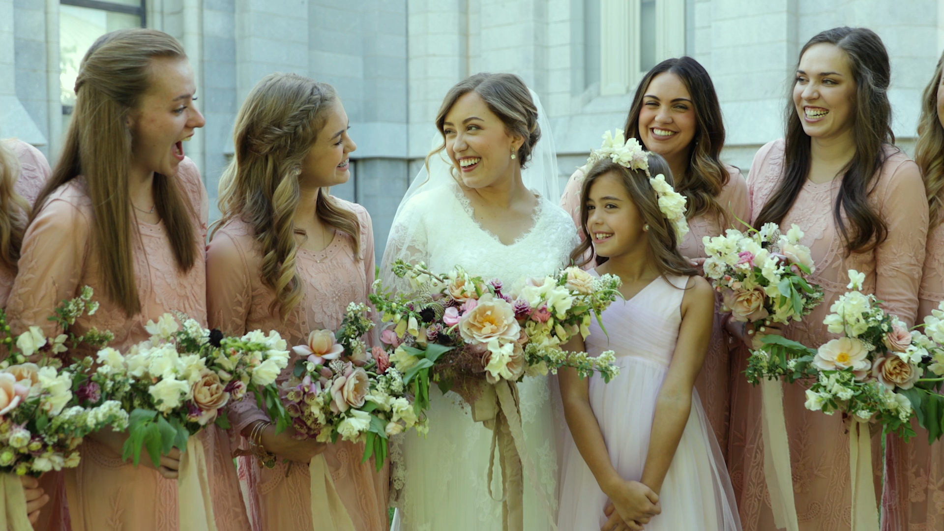
One thing to look out for with color of light is light reflecting off of colorful objects giving an unwanted color cast to your image. For example, if you’re shooting in a big grass field, you’ll probably get the sun reflecting off of the grass onto your subject, creating a green tint on your subject.
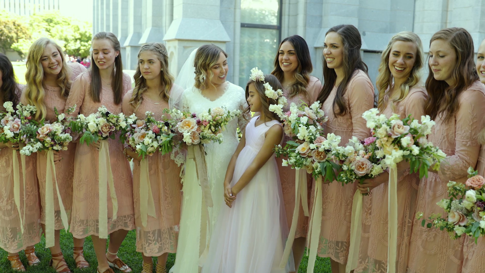
So just because you’re direction of light is good, in this case, I was shooting in the shade so I have even light, my light quantity is good because there’s plenty of light outside, my light quality is nice as the sun reflecting off the grass acts as a giant diffuser and creates nice soft light, BUT because it’s reflecting off of the green grass, our light COLOR makes our subjects look green and sick as you can see in the above picture. Now because there wasn’t much I could do in this situation I just had to color correct in post by adding back in some magenta as you can see in the following pictures:
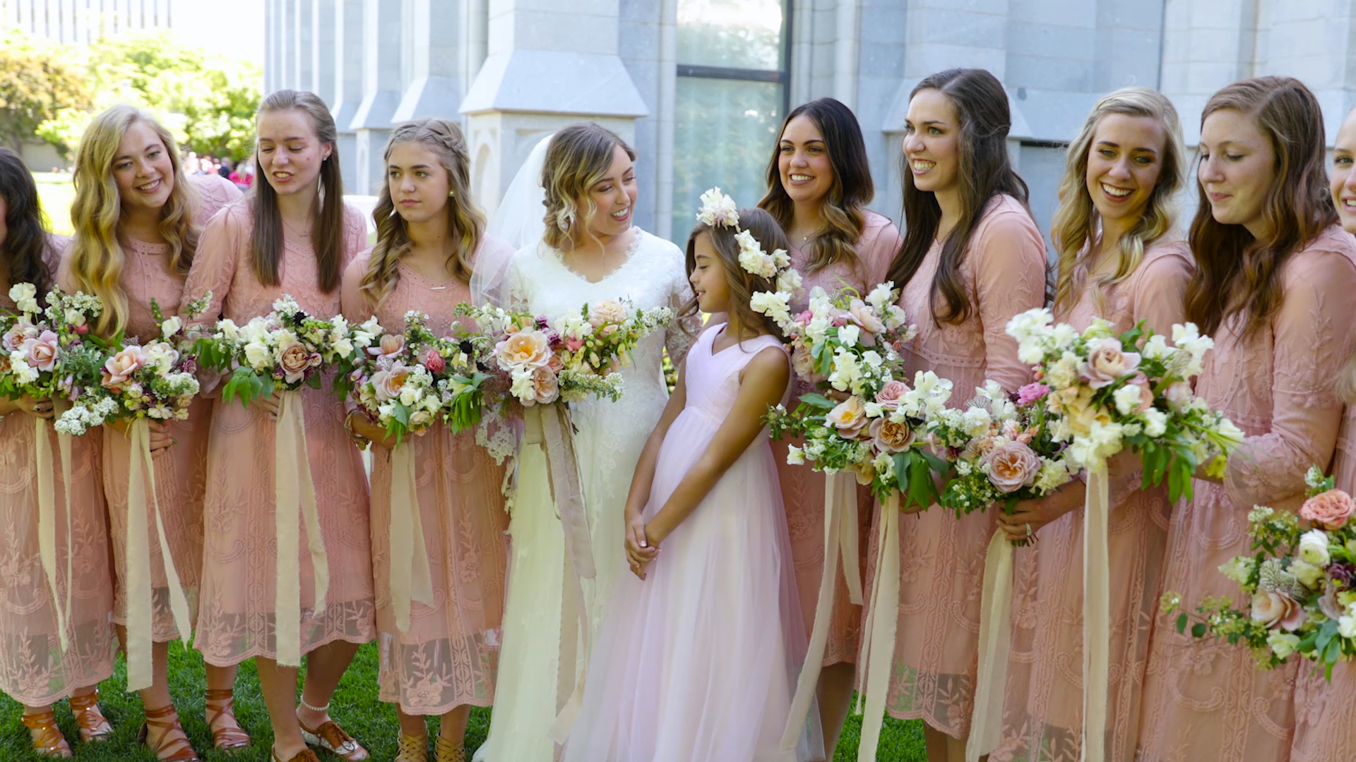
The point is to be aware of the color of light as well as that 2nd characteristic of light because everything else about the lighting can be perfect, but if the color of light isn’t flattering, it still won’t look good.
That’s it for CINEMATIC LIGHTING TECHNIQUES using Direction and Color of Light, hope you learned something new, make sure to check out part 2 where we’ll discuss the difference between LIGHT QUALITY and LIGHT QUANTITY. (Part 2 is found in the full course at http://fulltimefilmmaker.com/
Don’t forget to check out my Instagram page at fulltimefilmmaker and Youtube Channel at Parker Walbeck
If you have any further questions, please let me know!

